
Here is an advert for Detol's alcohol hand wash. The clever thing they've done with this is to take an everyday situation and make the viewer think about what’s going on. No one would really think twice about holding these normally but by replacing these with a hand it makes it more personal and makes you think more about germs. This is reinforced with the hand having a plaster on it. It makes you think that you, in a way, need the product to protect yourself from these everyday situations.
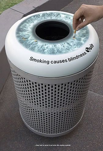

I think these two images are really successful as they incorporate the product with the message. The first image of stubbing out a cigarette on a bin works really well with the message. It instantly grabs your attention and is likely to make you think more about what you’re doing as a smoker.
The second image we have a cigarette bin. The front panel is slightly translucent and as it gets fuller it appears that the lungs are filling up too. Really clever idea actually, works so well at literally communicating the message. I think in general though, if design can have a purpose and a form of interaction it's always going to be more successful at pushing a message. We can all walk past posters, but these two take the form and incorporate a message that we can’t really avoid.

Here we have more of an environmental message concerning power consumption. It's a great piece of design but it will only really work at night. If you saw this during the day if wouldn’t really seem to have no impact at all.

Here's another design aiming to stop people smoking. The positioning of the design is obviously what’s key with this idea. The fact that it’s interacting the smoking, with what’s effectively pollution from the bus works really well. With the bus giving off pollution it also suggests that’s exactly what your breathing in, so what’s the point. With this main image, we then have the text, 'ready to quit'. I think after looking at this it would definitely get you thinking about quitting as it's a pretty powerful image.

This is one works really well. It's obviously communicating the effects of drink driving but in a really smart way. The design has been printed and posted on the full face of a pub/bar door, with the message 'it's a crime to drink and drive'. The idea communicates the effects and the consequences of the crime, and links it straight back into the worst case scenario.
The same can be said for the smoking images as well actually. The image jumps straight into the worst outcome and has a massive impact on the viewer. It's not saying, 'if you have another, drive a bit more carefully', its saying 'stop now, or you’ll find yourself here'. It would defiantly have an impact on the viewer and would persuade the individual to follow what it's communicating.

When it comes to worst case scenarios, this is pretty much as worse as it can get. Very strong then, with a big impact, this jumps straight to the point. The poster is for 'World No Tobacco day'. Not something I've heard of before but the message is pretty clear. Obviously thousands of graves, which the campaign is suggesting was from smoking.
There’s a strong divide with the image, between the non smoking 'green' area, suggesting health and the opposite with the graves. It's almost as if the posters saying, these are your options, make a choice.

No comments:
Post a Comment