Wednesday, 25 May 2011
Wednesday, 27 April 2011


Tuesday, 26 April 2011

Monday, 25 April 2011
Sega Research Main Texts
This text has been thoroughly read and is not just copied off the net. There is a lot of useful information within this text ranging from character knowledge to plots of the original TV series which helped me gain a better idea of the game and characters of them featured.
Thursday, 27 January 2011
Style / Pacing of my Ad
The pacing of my title is pretty simple, no voice overs no in your face titles. The style will be similar to the idea of these adverts. In particular the cadbury gorilla. They'll be a large build up and the titles at the end.
Tuesday, 25 January 2011
Monday, 24 January 2011
References For PS Brush Packs and Files
BRUSHES
http://designm.ag/resources/watercolor-photoshop-brushes/
http://partyboy9289.deviantart.com/art/Photoshop-City-Brushes-58590184
http://invisiblesnow.deviantart.com/art/Label-Brushes-43476963
http://afeaugas.deviantart.com/art/Urban-Brushes-49989857
http://www.smashingmagazine.com/2008/10/22/splatter-and-watercolour-brushes-for-photoshop/
http://qbrushes.net/photoshop-swirls-brushes/splatterism/
http://qbrushes.net/photoshop-splash-brushes/dried-blood-splatters/
http://designm.ag/resources/500-splatter-brushes-for-photoshop/
http://designm.ag/resources/paper-photoshop-brushes/
http://designm.ag/resources/retro-vintage-brushes/
TEXTURES
http://princess-of-shadows.deviantart.com/art/vintage-grunge-textures-79040200?q=boost%3Apopular+in%3Aresources%2Ftextures+Grunge&qo=1
http://designm.ag/category/freebies/
http://designm.ag/resources/2000-absolutely-free-textures/
FONTS
http://designm.ag/resources/headline-fonts/
http://designm.ag/resources/free-fonts-for-professional-design/
Friday, 21 January 2011
KYLE COOPER
Interview with Kyle Cooper. Great insights from the acclaimed title designer and (art) director on the use of typography in three classic main titles that made a big impression on him: The Dead Zone by Wayne Fitzgerald, To Kill A Mockingbird by Stephen Frankfurt and Walk On The Wild Side by Saul Bass.
Cooper, who feels more comfortable designing story-based main titles, talks about what one of his greatest main titles, next to Se7en, his opening en end credits for Dawn of the Dead.
Forget the Film, Watch the Titles is a website dedicated to title sequence design, featuring over 130 title sequences and interviews with designers:
http://watchthetitles.com
PRIMARY RESEARCH Title Sequences
A range of Title Sequenced I've researched from a selection of primary DVD's
Squences have been cut in after effects.
Squences have been cut in after effects.
Thursday, 20 January 2011
Alexey Kurbatov


Full Gallery @ http://www.behance.net/gallery/Illustrations-(april-2010-december-2010)/875748
Cristiano Siqueira


http://www.crisvector.com/
"I'm Cristiano Siqueira and people call me CrisVector too. I'm an Illustrator from Sao Paulo / Brazil, specialized in digital and vector illustration and this website is a showcase of my personal production and some works done for various clients around the world.
Contact
You are welcome. To contact me, drop your message here. Brasileiros falem comigo por aqui. For business proposals, job inquiries and artwork usage, please contact Erika Groeschel Inc. T. 212-685-3291
C. 646-258-1177 NYC erika@erikaillustrations.com"
Wednesday, 19 January 2011
Tuesday, 7 December 2010
Motion Graphics
Don't think all of this is done in after effects and theres a large combination of software but it' still pretty interesting.
Monday, 6 December 2010
Tuesday, 16 November 2010
Monday, 15 November 2010
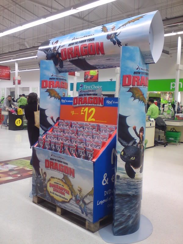
POS Idea
Saw this in Asda tonight. Never considered the idea for a stand or POS. Just focussed on designing the products. But, we will need a place for display and this idea is great.
The pos is positioned right at the front of the store and the height really makes it visible and attracts you in. We went over to check it out and even picked up the DVD and read back of case. But without the stand I wouldnt have picked up some dragon film off a shelf. So it obviously works.
The pos is positioned right at the front of the store and the height really makes it visible and attracts you in. We went over to check it out and even picked up the DVD and read back of case. But without the stand I wouldnt have picked up some dragon film off a shelf. So it obviously works.
What size to do the posters??
The promotional posters are fairly obvious because I know they need to large format and highly visible hense decisions in type size and thickness etc. Although the smaller posters I'd be using for sale and dressing areas don't really need to be huge.
Not just in terms of costing but toying between the idea of A1 and A2 I'm starting to lean towards A2. I've got examples of past prints in these sizes in front of me now and in thinking who'd be buying the posters, would they want an A1?
Spoke to a few people about this today and a lot of people said that you'd think bigger the better with these things but A2's generally a good solid size. If it was being stuck up onto someones wall it's not too big but still an effective size.
It is hard to say at this point anyway, probably best to run some prints though in varied sizes and get some feedback off that.
Sunday, 14 November 2010
Foundation Tees
One thing to really note about this is how littler theyre related to any cause or charity, they just look appealing. I think is a good thing as your almost giving to charity without even knowing about it. You buy the product becuase its appealing whilst QS hand 3% over to a good cause.
______________________________________________________
Foundation Tees
By Taylor Cotton | Published March 17th, 2010
New Quiksilver Foundation tees for summer!
QUIKSILVER FOUNDATION ART TEES
______________________________________________________
Foundation Tees
By Taylor Cotton | Published March 17th, 2010
New Quiksilver Foundation tees for summer!
QUIKSILVER FOUNDATION ART TEES

The Quiksilver Foundation art tees for summer 2010 is a collaboration between Brookes Reeder and Scott Massey. With the photography of Brookes Reeder and the DIY style of Scott Masey we have two tees that echo an environmental theme by content or implied simply by the recycled process of collage. Please visit www.rrrproject.com to gain info on Scott’s new book, RRR.01, which Brookes has also contributed.
design/cut Scott Massey – www.nohawk.com
photos Brookes Reeder – www.stumpystudios.net
3% of each Foundation tee sold will be donated to the Quiksilver Foundation to enhance the quality of life for communities of boardriders across the world by supporting environmental, educational, health and youth-related projects.
QUIKSILVER AND HOPE ARTIST NAIROBI COLLABORATION

The Quiksilver Foundation supported the 2009 HOPE social mission to Nairobi, Kenya with the intention of bringing artist and media to places in need. 3% of each Quiksilver X HOPE tee sold will benefit the HOPE campaign in continued support of artist in global education and peace programs everywhere.
H.O.P.E. or Helping Other People Everywhere is an energy concious 501(c)3 non-profit focused on involving artist and their contributions in campaigns, programs and events to support existing social projects that promote education and peace around the world.
Pink Cypher J-Dub Boardshort
Taken from QS Foundation Web. An example of designers creating products to be sold through QSF. 3% of proceeds to to charity and as pictured below, they're displayed on riders to make them more desirable/cool, pink or not!
Pink Cypher J-Dub Boardshort
By Taylor Cotton | Published March 18th, 2010
Julian Wilson’s signature Cypher J-Dub boardshort will be available in a limited edition pink colorway this summer! 3% of the proceeds raised from the sale of these boardshorts will be donated to support Keep A Breast education, awareness and breast cancer prevention programs.
To learn more about Keep A Breast visit their website at www.keep-a-breast.org.


Dane Reynolds approved!

Sponsors
Main consistant sponsorship coming from Orange, Sony Ericsson.
Previously Sponsored Events :
King of the Groms
Pro France
Pro Portugal
Tony Hawk and Friends
Radar
Estoril
Why do it, how do they benefit?
Quiksilver tours are huge events drawing in thousands of young people. Sony market products towards this group and work in conjunction with QS on various products.
"During the next week will launch the new Sony Ericsson Quiksilver Spiro, exclusive to the TMN network. The phone will be available in all the outlets of TMN, and Quiksilver stores (Columbus, Ericeira, Lisbon, Guide, Porto, Porto and Cascais).Should you buy the new Sony Ericsson phone in a store QUIKSILVER TMN will also receive a voucher worth 10 €. After only have to drive to one of the Quiksilver Stores and exchange the voucher for € 10 at Quiksilver products and / or Roxy."
http://seinsider.com/?p=3836

Other previous major sponsors of QuikSilver
Peugeot
Peugeot 106 Quicksilver
Peugeot 206 Quicksilver
Virgin Media
Virgin Travel
Saturday, 13 November 2010
Ideas - Possible Logo - "Goat Boater"
Research
Basically I wanted to combine some of the design ideas I've being playing around with to the events title, The Goat Boater. To do this I thought it best to start getting some reference images to start working over and try to build a base for how I wanted them to look.
I've stuck with the same colour palette previously chosen as these came out best in testing and were maintained throughout for consistancy.
Refs
3 Main ideas below, there are some VERY initial ideas that I'm a little reluctant to put on as they're really quite terrible. Should also point out these are just initial ideas for now:
LINK to DP POST
Friday, 12 November 2010
Name of THE EVENT
Chosen name for the event will be
THE GOAT BOATER
Basing this on the reason that it's catchy. It's slightly humerous as well that will relate to a younger group and it actually relates to surfing curture and it's nothing offensive. It's fun light and has a cool flow to it.
Goat Boater
Derogatory term for kayakers and wave skiers
This will appear on everything connected to the Event. Posters, products, promo, everything.
"where ya off?" - "off to goat boater mannnn"... Think it works
Finding a Name for the Event
To get some inspiration I started to look at surfing again and the terms. Found out some pretty interesting stuff actually, listen below..
http://www.surfing-waves.com/surf_talk.htm
Point Break - The Swayze / Reeves flick entitled "Point Break" was named after this type of wave! The point break is a wave that breaks onto a rocky point. A good example of a point break is Bells Beach in Australia. (It's nice how this links the film and the wave together!)
http://www.imdb.com/title/tt0102685/ <- Film link if you can't remember what it was about.
Billabong
What Australians call a watering hole, but to everyone else it is one of the largest surfing equipment and clothing manufacturers out there.
Goat Boater
Derogatory term for kayakers and wave skiers
Gremmie / Grommet / Grom
Any of the above can be used to describe a young or inexperienced surfer. Grommet is also the cute doggie character in the Nick Park animation creations. (And they are really rather good!)
Keg
Another word for a barrel / tube
The term given to trick surfing — airs, shove-its, etc.
Someone who buys surf gear and clothing but does not surf
http://www.surfing-waves.com/surf_talk.htm
Point Break - The Swayze / Reeves flick entitled "Point Break" was named after this type of wave! The point break is a wave that breaks onto a rocky point. A good example of a point break is Bells Beach in Australia. (It's nice how this links the film and the wave together!)
http://www.imdb.com/title/tt0102685/ <- Film link if you can't remember what it was about.
Billabong
What Australians call a watering hole, but to everyone else it is one of the largest surfing equipment and clothing manufacturers out there.
Goat Boater
Derogatory term for kayakers and wave skiers
Gremmie / Grommet / Grom
Any of the above can be used to describe a young or inexperienced surfer. Grommet is also the cute doggie character in the Nick Park animation creations. (And they are really rather good!)
Keg
Another word for a barrel / tube
New School
Noodled / Noodle Arms
Being exhausted or having tired arms
Offshore
This is when the wind at a surf break is blowing off the shore ;-), It makes for ideal surfing conditions.
Party Wave
A wave surfed by several people at once
Rail
Rails are the sides of your surfboard, running from nose to tail and back again.
Rail Bang
To fall off and take the surfboard between the legs (Ouch!)
Someone who buys surf gear and clothing but does not surf
Proposed Product Range
Clothing
1. Shirts – 4 Designs incorporating the charity logo. Boys/Girls 2 Each
2. Hat / Cap – 3 Designs
3. Shorts – 2 Designs Boys/Girls
Promotional and Event Material
1. Posters – Set of 5 to be displayed around the area for publicity. Also to be used as display in and around the event.
2. Banners – 2 Designs. Signage displayed around the event featuring sponsorship information.
3. Flyers – To be used as a sub to the poster. Promotion leaflets available around the event area to draw people in. Also applicable within the event, outlining times and schedules.
4. Tickets – Design for the entry ticket. Design should outline information such as all areas and include sponsor logos etc.
5. Certification Boards – These will be the large format boards awarded to the surfer. They will not be pre written with details of the riders name etc, this will be left black to be written on the day of the event.
6. Site Map Poster – Layout to be displayed at the main entrance of the event depicting the various elements of the event.
7. Umbrellas – 1/2 designs maximum. Used for dressing blank areas of the beach.
8. Tents – A shaded area for the adjudicators, QS logo and Sponsorship to be shown. This is a large impact piece for the viewer so visibility on both the design and sponsors will be high impact.
Print Products
1. Surfboards, Vinyl Wrap to be applied to the top section of the board. To be largely seen as ‘skins’. Interchangeable designs for riders.
2. Stickers – Pack form, up to 20 separate designs for the brand and event.
3. The ‘Quik Fold’. Range of 5. This is the folded poster I’ll be running. The poster is obviously flat to begin with however is perforated to easily pop out and be folded into a spherical ball, the Truncated icosahedrons.
4. The ‘Quik Cards’. Range of 50 cards. This is the pack that allows the user to construct shapes and create forms by stacking the cards in endless variations.
5. Lanyard – 1 of, need to be simple in form due to printing limitations.
6. Book marks/Collectables – Range of 8.
Event Research Products - Exhisting Photography
Board Design, Stickers and water buoy
Stickers
Lanyards, nice idea these because of there popularity and people would like to be seen with them (needs supporting from questionnaire)
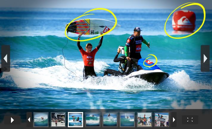
Event Research Promotion - Exhisting Photography
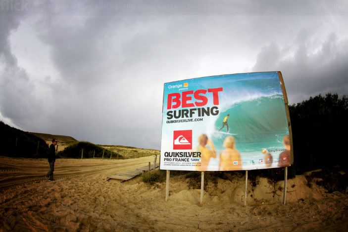
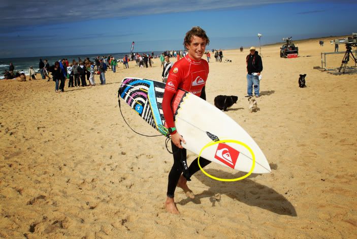
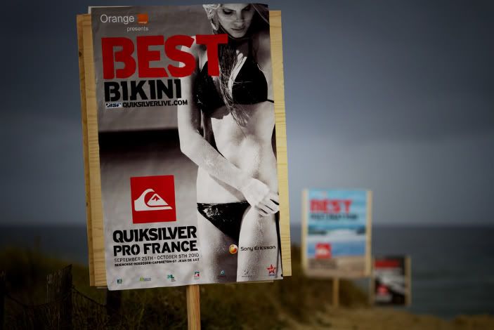
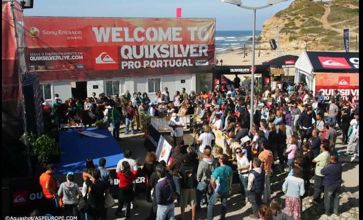
Bright bold and colourful photos. Clearly depicts the event, surfing and the team behind it, 'QuikSilver'. Link to web address and sponsors shown below.
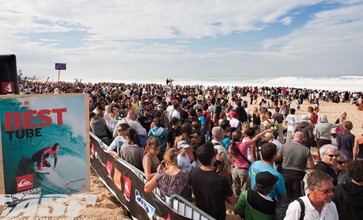
Sponsor organised competitions within the events, pretty good event too!
Pretty important this one, something I completely over looked... A site MAP
Event Research - Exhisting Photography
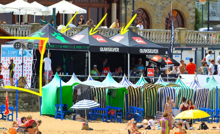
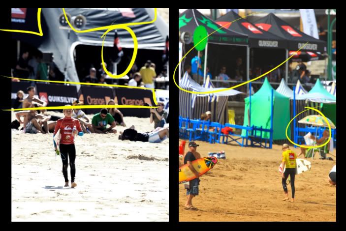
Shaded areas for the judging panel and umbreallas. Outlined to the left, Photographic area with competition design and sponsorships features.
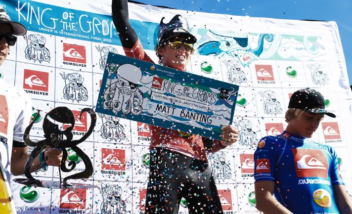
Certificates on generic boards, prize / titles and names are then handwritten onto the board.
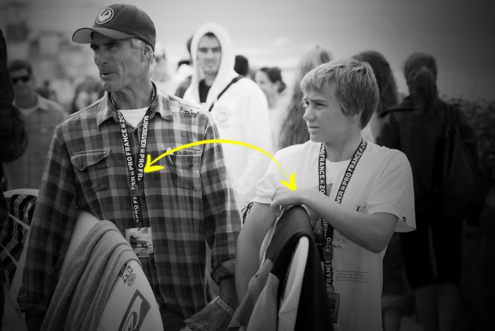
More boards from Pro Portugal. Note the Sony Ericson sponsor ship in the upper left. Sony have sponsored 5 consecutive events for 5 years so far.
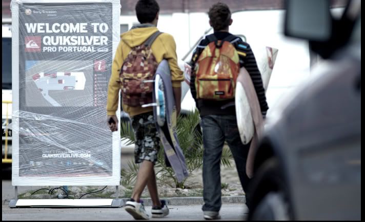
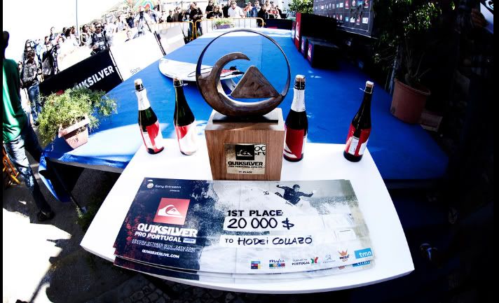
'Base Camp' Lots of material here depicting the event and areas of the course.
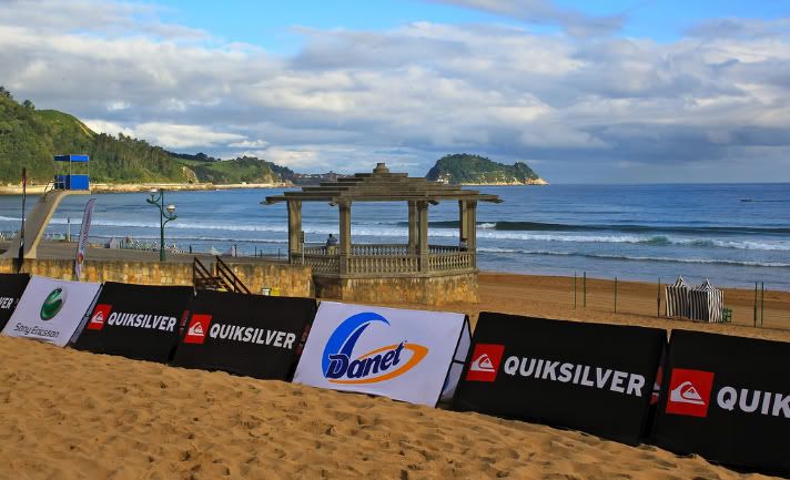
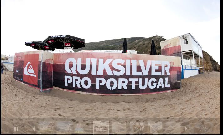
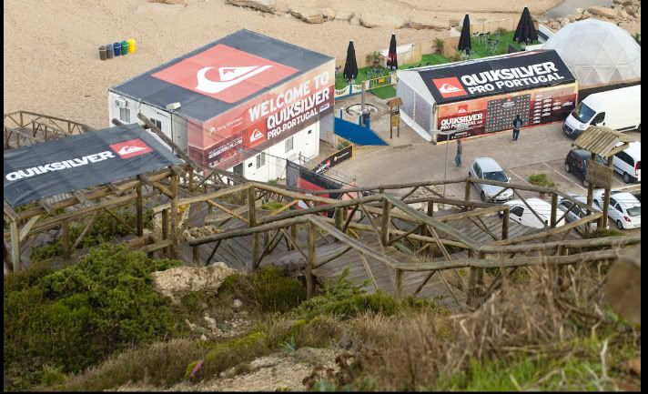
Boards, signage and sponsorship are litered around the event creating a boundary around the event and a chance for sponsors to seen around the event.
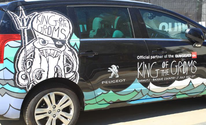
Mobile advertising. Sponsors providing event sponsorship whilst drawing attention to themselves.
Subscribe to:
Posts (Atom)